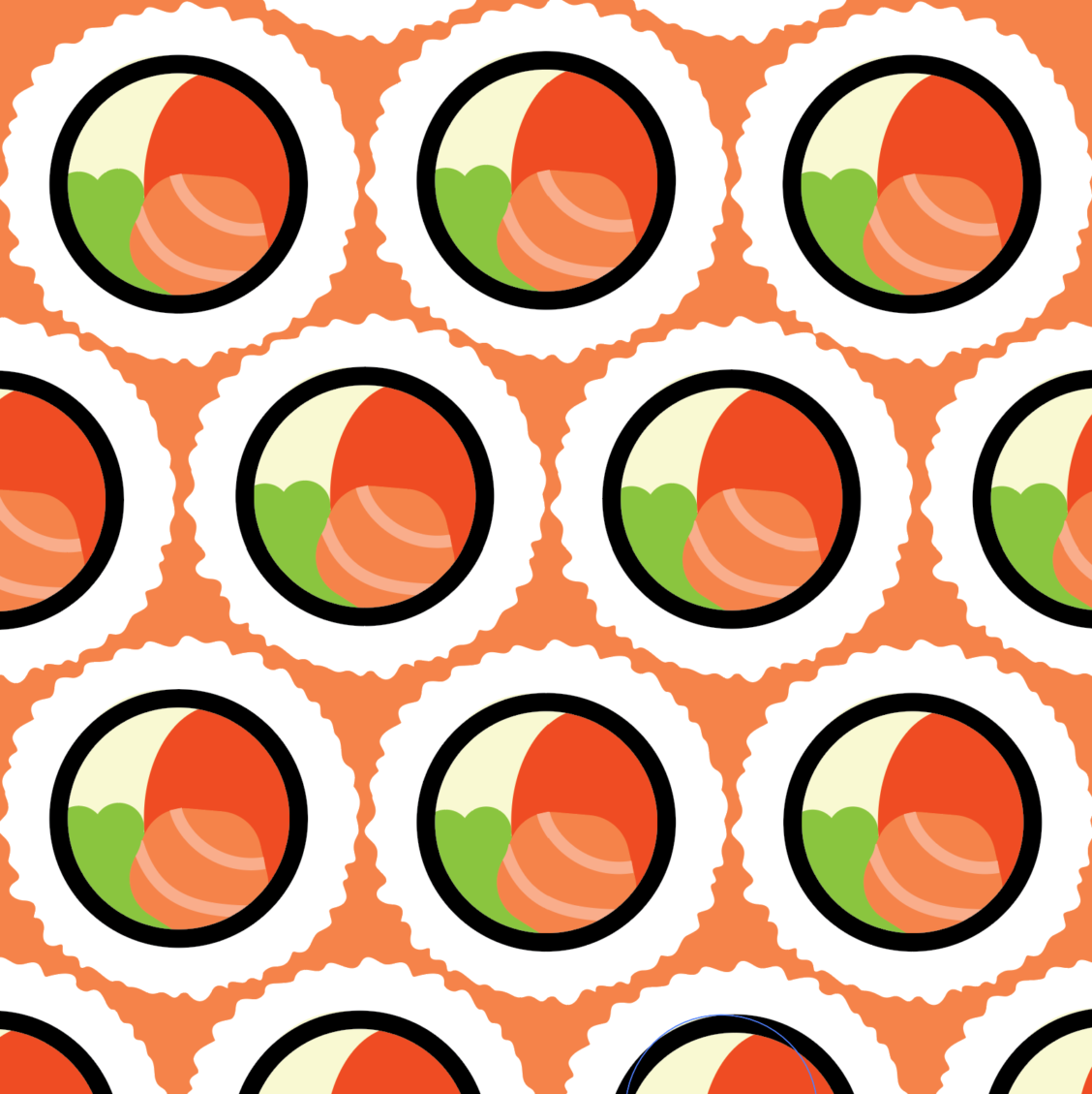
This pattern was incredibly fun to design. Inspired by one of my top favorite foods, I developed this pattern to pair well with a Japanese buffet poster I had developed in college. The flat colors simplify the work without taking away from the piece. It is fun, energetic, and directly gets your mind on the delicious food, as it was originally intended. With a pattern like this, the goal of this art is not to be the main focal point. Even though it more directly communicates sushi then a typeface on a buffet poster might, it has the job of catching the viewers attention to then direct it straight to the poster’s information. It does this by not being less noisy, with the minimalist look, to communicates its sushi message. After, it then invites the viewer to pursue the given information. It was fun creating a digital pattern for my project, and inspires me to create more eye catching pieces.